Exit This Side
If it matters enough to show, why isn't it announced too?

Last week on the A train in New York, I noticed a sign above the doors on new R211 trains. It said, “Exit This Side.” I thought it was thoughtful in the sense that it reduced guesswork and lowered cognitive load for passengers. But shortly after, it hit me. If this matters enough to show, why isn’t it announced too?
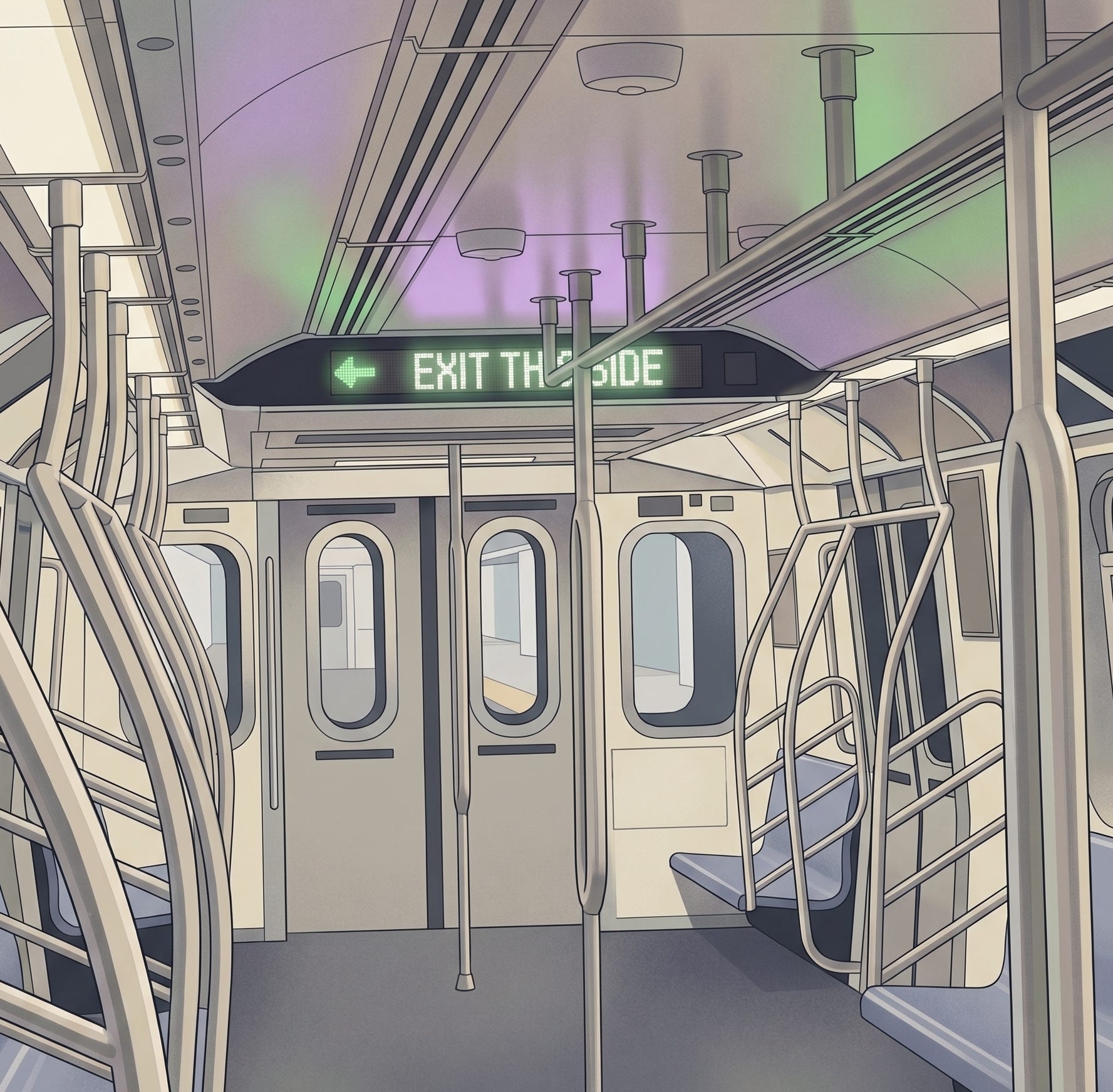
The subway is more than just trains, tracks, and maps. It is also an information system, but not all of that information arrives the same way. Some of it is direct, like an announcement over the speaker or a message on the screens above the doors. Some of it can only be caught in real time, like a delay, a skipped stop, or a sudden service change. And some of it is never really stated at all. It lives in the crowd, in the way people move before a stop, in whether a car looks too packed to enter, or whether there is space a few feet in.
My first instinct was to give New York’s transit agency, the MTA, the benefit of the doubt and think critically about the design problem. Left and right can feel subjective on a train, since people are often facing different directions. That seemed like a plausible reason the subway avoids announcing it. Then I remembered hearing this kind of announcement on the subway in India a decade ago. The Delhi Metro explicitly lists “correct side platform announcements” as part of its accessibility features, which makes me wonder how they solved the orientation problem. More importantly, it makes the omission here harder to see as a challenging design problem.
On the ride from 125th Street to 59th Street, I kept thinking about how the issue is bigger than one missing announcement. So much of subway riding depends on ambient visual awareness. Some of that information is static, like the label for the emergency brake cord or the MTA help and safety information on the wall. Some of it is live and spatial, like whether a seat just opened up, which side will matter at the next stop, whether there is room in a given part of the car, where to position yourself before the stop, and how to move without hitting someone. Sighted riders take in so much of this almost instantly that it barely even registers as information.
And it is not shared equally.
For blind and low-vision riders, these moments can lead to hesitation, extra effort, guesswork, or dependence. I recently heard, in a work-adjacent conversation, about a blind rider who navigated trains by heading toward specific parts of the car he knew how to reach, then having people offer him the seat. His strategy worked, but it ran on priors. Memory, routine, and a model of the train built up over years of riding it. It worked, but that is different from the system being built to be equivalently accessible.
The MTA does seem to recognize parts of this in at least two ways. (1) App-based accessibility. (2) Newer train models and broader accessibility features.
The first appears in applications such as NaviLens and tactile maps, which the MTA has tested at Jay St-MetroTech as part of its Accessible Station Lab. NaviLens turns visual information into audio formats for blind and low vision riders, including wayfinding, navigation, and real-time transit information.
Still, there is a difference between a helpful tool and a burden that has quietly been shifted onto the rider. A public system should not assume that essential trip information can sit behind a smartphone, a download, prior setup, battery life, cell service, or the knowledge that the tool exists in the first place. That is far from having accessibility baked into the navigation experience itself. At some point, an app stops being a supplement and starts to seem like a workaround.
The second response is newer train models. The new R211 cars are framed by the MTA as modernization, with digital screens, wider doors, and additional accessible seating. The MTA’s Chief Accessibility Officer described them as a meaningful shift in the riding experience for passengers with disabilities. But the same car carries the sign I started this piece with, and never says “Exit This Side” out loud. The experience still feels assembled rather than well-designed.
What gets announced, what gets signaled, what gets left to local knowledge, and what gets pushed into apps all reveal who the city treats as its default rider. In Inclusion and Democracy, the political theorist Iris Marion Young argues that inclusion is shaped not only by formal policy but by the norms, assumptions, and arrangements people are expected to navigate. A subway car is one of those arrangements.
So if the goal is a system that works for everyone, the answer cannot keep being a better app or a newer train with better visual or aural cues. Those are patches. The harder, more durable thing is to bake access into the design itself, to make information multimodal across visual, audible, spatial, and tactile channels, to meet every rider where they already are, and to stop treating equivalence as something riders have to assemble for themselves. The current efforts are real, measurable improvements. But the next step is to redesign them into one coherent system, rather than keep building on existing patches.
Insightful stuff, I like the idea of delivering the same info in a variety of forms. My parents struggle to use the subway whenever they visit, and more audio cues would definitely help
Great points! Never noticed how the MTA doesn’t tell you which side the platform is on